How do design tokens work? Start with three buttons in the same color
How Salesforce, the W3C DTCG, Material Design 3, Adobe Spectrum, IBM Carbon and Nathan Curtis define design tokens, illustrated with three same-colored buttons and a small form exercise.
Contents
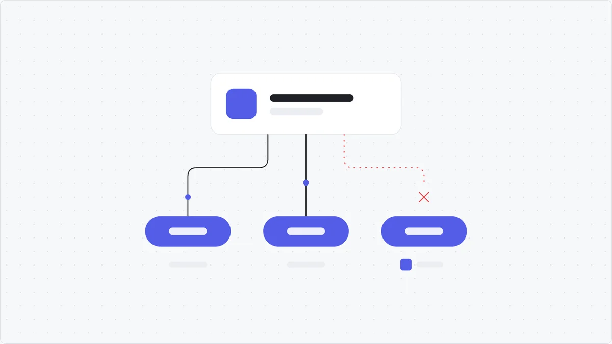
Three buttons in the same blue. Change the color once, and only two of them follow. That small detail tells you whether your interface really uses design tokens or just “looks the same”.
TL;DR
- A design token is a named design decision, at minimum a name and value pair, that design, tools and code all reference (W3C DTCG, Material Design 3).
- Matching colors do not prove a token is in use. What you need to check is where that spot gets its value from.
- Large systems all separate at least two layers: a palette of base values and the roles that use them. Material calls them reference / system / component, Spectrum calls them global / alias / component, and Carbon names tokens by role (Material, Spectrum, Carbon).
- Same color today does not mean they should change together. The question that decides sharing: do these places need to move together when the design changes?
- Start small: one form, four roles, bind them, then try changing one value. A token file does not sync Figma and code on its own; you still check every stage up to the real interface.
1. What is a design token, and why is looking at the color not enough?
A token is a named decision. Two things with the same color only truly “share” when they reference that same decision.
Take a hypothetical order management app. The create order screen, the edit order screen and the confirmation dialog all have a blue button.
The first two buttons take their color from a shared decision called “primary action background”. The third has its color code typed in directly. On screen, the three look exactly the same.
Now I change “primary action background” to another color. The two bound buttons follow. The hand-typed button keeps the old color.
| Button | Where the color comes from | When the shared decision changes |
|---|---|---|
| Create order | References “primary action background” | Gets the new value |
| Save order | References the same shared decision | Gets the new value |
| Confirm | Color code typed in directly | Keeps the typed value |
TRY IT
Primary action background
#3D8BFFSame color, but only the first two follow the source.
Try changing the source color. The demo only simulates the mechanism; it is not connected to Figma or a real product.
For newcomers, I read a token through three questions:
- Name: what am I deciding?
- Value: how is that decision expressed right now?
- Usage: which parts take their value from it?
In the example above, the name is “primary action background”, the current value is a blue, and the usage is the two bound buttons. Copy the color code out to use on its own, and the link breaks.
How major sources define a design token
The wording differs, but the idea is the same: name design decisions so every place references them instead of copying values. (Expand to read more)
🏷️ Salesforce (2014) - where the design token concept was born.
According to the W3C Design Tokens Community Group, Jina Anne coined the term “design tokens” with Jon Levine while working at Salesforce. Nathan Curtis (EightShapes) credits Salesforce with pioneering the concept in 2014.
📐 W3C Design Tokens Community Group - DTCG Format 2025.10
The specification defines a token as information associated with a human-readable name, at minimum a name and value pair. A token’s value can be a reference to another token (for example {{color.blue.600}}). The goal of the specification is to let tools exchange tokens with each other. Note: this is a Community Group report, not a W3C Standard.
🎨 Google Material Design 3
Material describes tokens as small, reusable design decisions that replace static values with self-explanatory names. A token has a name (such as md.ref.palette.secondary90) and a value (such as #E8DEF8); the value can be a color, a font, a size or another token. When design and code reference the same token, both use exactly the same color, even after the token’s color code is updated.
🧩 Figma Variables
In Figma, tokens are usually stored as variables and then bound to properties of the interface. Figma describes variables, collections and modes as the way to store, reuse and organize these values. Creating a variable named “blue” is only the technical step; the team still has to agree on where that color is used.
Takeaway
A token is not a color code chart. A token is a named decision, and the value inside it is allowed to change. The first check is always: where does this spot get its value from?
2. Layers: base values, roles and components
Large systems all separate base values from the roles that use them, so one role can change without dragging along everything that shares its color.
Now add a “See details” link. The link is blue too. When you want to change the primary action button color, should the link change with it?
If the answer is “not sure”, give them two separate roles. In this example, I organize it like this:
| Layer | Example name | Purpose |
|---|---|---|
| Base value, often called primitive | blue-600 |
Holds one blue in the palette |
| Role, often called semantic | action-background |
Picks the background for the primary action |
| Another role | link-text |
Picks the text color of links |
Here “primary action background” is written as the name action-background: one decision, one name for people and one for tools and code. At first, both action-background and link-text reference blue-600. If only the primary action needs to change, I point action-background at the new color and leave link-text as it is.
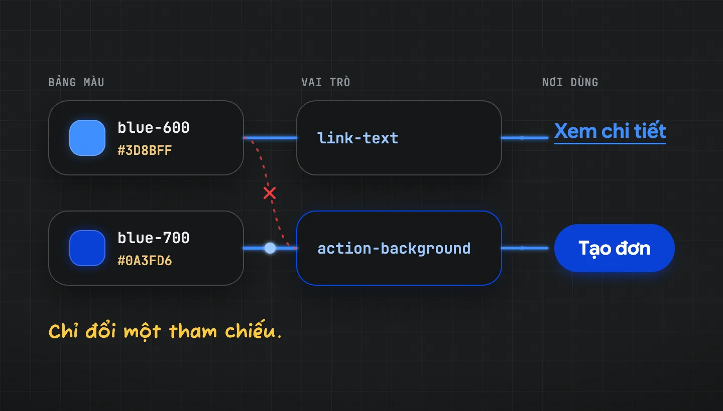
After the change: action-background picks blue-700, while link-text keeps using blue-600.
How large systems split their layers
Different names, nearly the same structure. (Expand to read more)
🎨 Material Design 3 - reference, system, component.
Reference tokens are all the available options and do not change with context. System tokens are decisions that give reference tokens a purpose, and they are where theming happens: the same system token can point to different reference tokens in light and dark themes. Component tokens assign properties to parts of a component, such as the icon color inside a button. These three layers let a team change a decision for the whole system or for a single component.
🅰️ Adobe Spectrum - global, alias, component.
Global (primitive) tokens define the values available in the design language and carry almost no usage intent. Alias tokens reference another token instead of a final value, to make a decision explicit for a specific context. Component tokens are used sparingly; Spectrum prefers reusable semantic tokens.
🔷 IBM Carbon - tokens named by role.
Carbon defines a token as a role-based identifier that does not change between themes; only the value assigned to the token changes per theme. Token names describe the part of the interface and its role, such as $text-primary or $border-subtle. Every theme shares the same tokens and roles and differs only in values.
✍️ Nathan Curtis, EightShapes (2020) - how to name tokens.
Curtis proposes building names from levels: a base of category (color), concept (action, feedback) and property (background, text); modifiers when needed, such as variant (primary), state (hover), scale (100) or mode; an object when the token belongs to a component; and a namespace for the system or theme name. In his view, good token names help a team keep a shared understanding of visual style as the system spreads across platforms.
The rule
Name the base palette by shade (blue-600); name the places it is applied by role (action-background). Two places should share a token only when they need to move together when the design changes. The same goes for two spacings that both equal 16 px: the gap between fields and the gap between two content groups may need to change independently. You do not need all three layers from day one; if fewer layers are enough to manage, start with fewer.
3. Benefits: why large systems invest in tokens
The benefit is not changing colors faster, it is everyone talking about the same decision. (Expand to read more)
🎯 One source of truth
Material Design 3 writes that tokens give a system one place to record style choices and track changes. As the number of screens grows, I no longer have to remember every place a color was typed by hand.
🌗 Themes and contexts
Because tokens are tied to roles, switching themes changes values, not names. Carbon has four themes sharing one set of tokens; Material uses system tokens to switch to a high contrast palette or a larger type scale for TV screens.
🤝 Design and code speak the same language
According to Material, when design and code reference the same token, teams run into fewer mix-ups at handoff. A role name like “error message text” is easier to decide on than “the third red”.
⚠️ When tokens are not worth it yet
Material also says plainly that tokens help less when a product uses fixed values that are unlikely to change in the next year or two, or when the product has no design system yet. The real benefit depends on how the interface is bound and on the team’s update process.
In short, tokens pay off when the design keeps changing and runs across many screens or platforms. If the interface barely moves, a clear color palette may already be enough.
4. Start with a small form
You do not need hundreds of tokens. A form with four roles is enough for one complete loop.
Start with a form that has a title, input fields, an error message and a submit button.
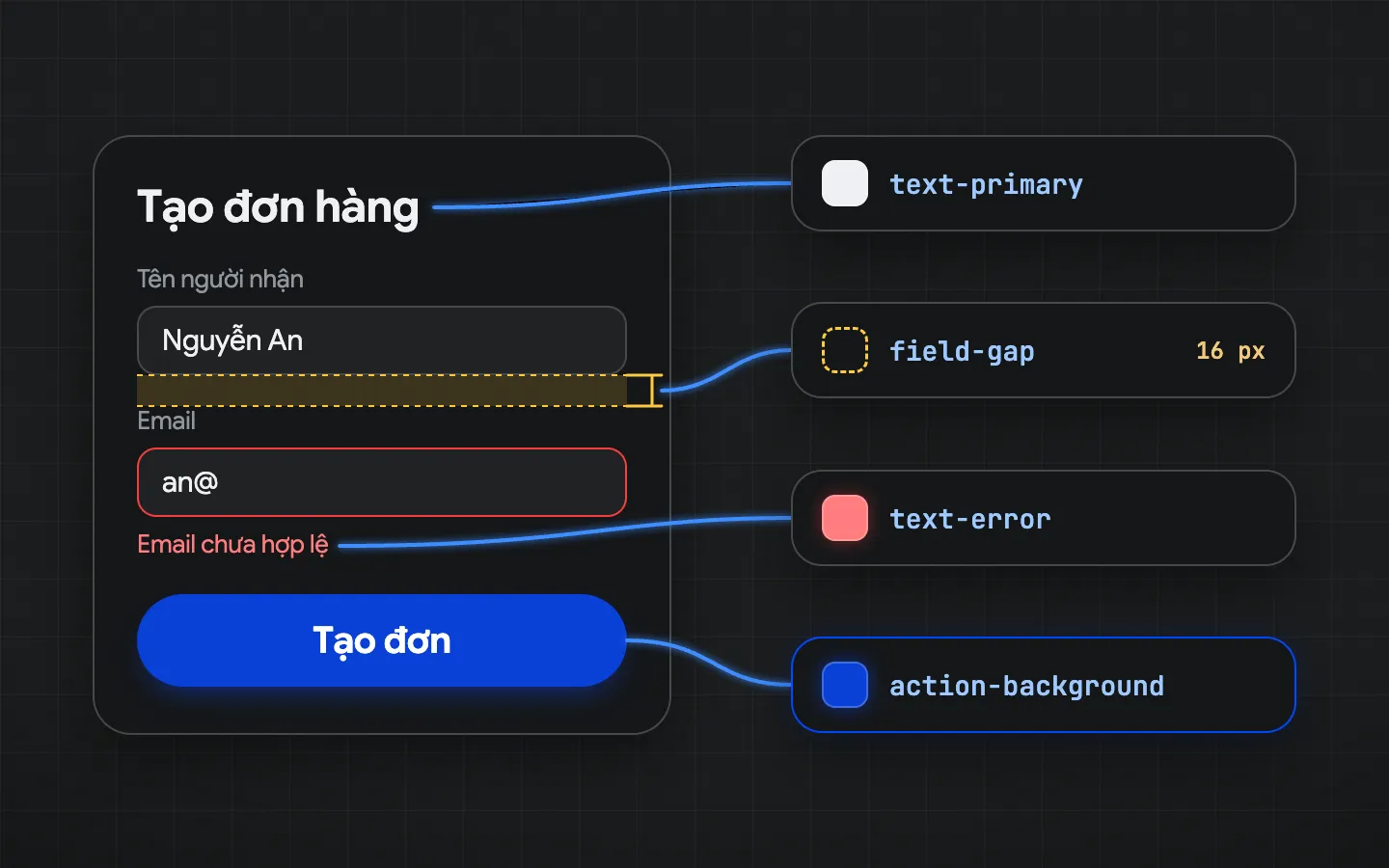
A practice form: identify the roles of the text, the error, the button and the gap between two fields, then bind each property.
1. Write down the decisions that repeat. For example: the primary text color, the error message color, the primary action background and the spacing between fields. Do not rush to group every identical value together.
2. Name tokens by what their users need to decide. “Error message text” is easier to decide on than “the third red”. The base palette is still named by shade; the places it is applied need role names.
3. Bind them to the interface. Check each element’s actual properties, not just a screenshot. If the button still holds a hand-typed color code, it is not yet taking its value from the shared decision.
4. Try changing one value in a test copy. Watch what changes and what stays. Does the button update? Does the link change by accident? Is the text still readable on the new background? When you are done, change the value back.
5. Changed in the library does not mean changed in the product
A change has to reach the place users actually see, and every stage needs a check.
It is like editing the source file of a poster: the printed copies stay old until they are reprinted. In a workflow with both Figma and code, follow each stage: the token source has changed, the token file has been exported again, the app uses the new version, and the interface displays it correctly.
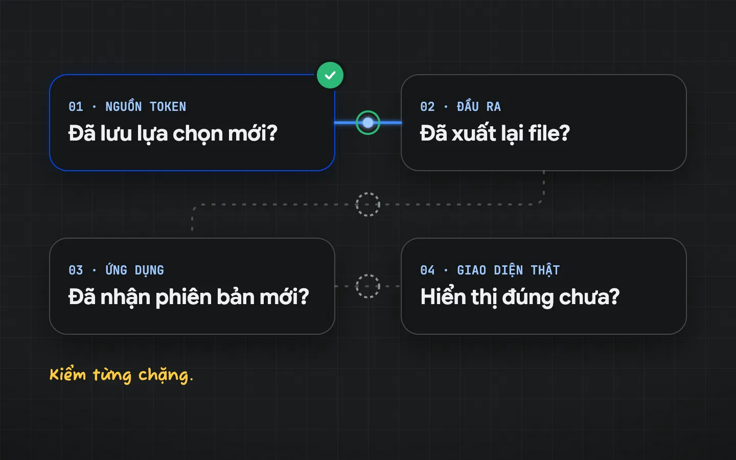
Check each stage of your team’s actual pipeline. This diagram does not assume Figma and code sync on their own.
🔁 DTCG and Style Dictionary - a shared format and an export tool.
DTCG only describes a format so tools can exchange tokens. Tools such as Style Dictionary read token files and export them for each platform (CSS, iOS, Android…) and are compatible with the DTCG specification. Having a token file does not mean Figma and code are in sync; connecting these steps is still your team’s process.
Likewise, the name text-primary does not by itself guarantee readable text on every background. I still need to check it in the states, themes and sizes in use. Shared values make change organized; the quality of the decision is still a design responsibility.
Conclusion
Back to the three buttons at the start. Before asking “do the colors match yet?”, ask three more questions:
- Where does this spot get its color from?
- When the source changes, does this spot follow?
- Is anything that should not follow still sharing it?
If you can answer all three, you know whether your token system is really working.
References
- W3C Design Tokens Community Group: Design Tokens Format Module 2025.10
- W3C Design Tokens Community Group: Thank you, Jina and Val
- Nathan Curtis, EightShapes: Naming Tokens in Design Systems
- Google Material Design 3: Design tokens
- Adobe Spectrum: Design tokens
- IBM Carbon Design System: Themes
- Figma Help Center: Overview of variables, collections and modes
- Style Dictionary: Export your design tokens to any platform